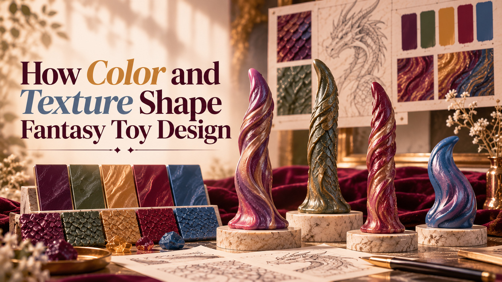
Fantasy toy colors and textures play an important role in shaping a product’s visual identity. From rich jewel tones to intricate sculpted patterns, these design elements help define the appearance of fantasy-inspired products and distinguish one creative concept from another.
Unlike conventional product designs that often focus on familiar shapes, fantasy toy design draws inspiration from dragons, mythical creatures, fictional worlds, and imaginative character concepts. Color palettes, surface finishes, and molded details work together to create a distinctive aesthetic that reflects the idea behind each design.
Understanding how fantasy toy colors and textures work together offers a new way to appreciate the creative decisions behind fantasy-inspired products. In this guide, we’ll explore color palettes, surface details, visual contrast, material finishes, and how these elements influence the overall appearance of a design.
Why Color Matters in Fantasy Toy Design
Color is often one of the first details people notice when looking at a product. In fantasy toy design, color can establish a mood, emphasize distinctive features, and communicate ideas associated with dragons, mythical creatures, and fictional environments. The right palette can make a design appear mysterious, elegant, playful, or dramatic without changing its underlying shape.
When designers consider fantasy toy colors and textures, they look beyond individual shades and consider how the complete palette works with the product’s silhouette and surface details. This helps create a more cohesive visual identity rather than a design in which colors compete for attention.
Creating a Distinct Visual Identity
A product’s color palette can become an important part of its recognizable identity. Emerald green and antique gold may suggest a classic dragon-inspired aesthetic, while violet, silver, and deep blue can create a more otherworldly appearance. These associations are creative interpretations rather than fixed rules, giving designers room to explore different combinations.
Color also helps distinguish products that share similar shapes. Two fantasy-inspired designs may have comparable silhouettes but feel entirely different because one uses muted earth tones and the other features bright, contrasting shades. This flexibility allows designers to develop unique visual styles around related concepts.
Using Color to Establish Mood
Different color combinations can create different visual impressions. Darker palettes may produce a dramatic or mysterious appearance, while brighter colors can make a design feel energetic and playful. Softer or more muted shades may place greater emphasis on the product’s shape and sculpted details.
When developing fantasy toy colors and textures, designers need to consider the relationship between color, lighting, and surface finish. A shade that looks subtle on a matte surface may appear more striking on a glossy one, so the final effect depends on more than the color itself.
Popular Color Palettes in Fantasy-Inspired Designs
Fantasy-inspired products can use a wide range of color palettes. Some draw from recognizable mythical creatures, gemstones, or natural landscapes, while others use abstract combinations that emphasize originality. The most suitable palette depends on the design concept, surface details, and intended aesthetic.
Exploring different fantasy toy colors and textures makes it easier to understand why products within the same category can have very different visual identities. Even when the underlying shapes are similar, color selection can dramatically change the overall impression.
Jewel Tones and Metallic Accents
Jewel tones such as emerald green, sapphire blue, ruby red, and amethyst purple are often associated with fantasy aesthetics. Their rich appearance can complement creature-inspired forms and create a sense of depth, particularly when paired with contrasting shades.
Metallic-looking accents, such as gold or silver, can introduce another visual layer. Depending on the material and finish, these accents may draw attention to ornamental features, raised patterns, or selected parts of a sculpted design. The key is to use accents in a way that supports the overall concept rather than overwhelming it.
Dark and Moody Color Combinations
Deep purple, charcoal, burgundy, midnight blue, and black can create a dramatic fantasy aesthetic. These colors may work especially well with pronounced contours or intricate surface details because shadows and highlights can help reveal the shape.
However, darker colors do not automatically make a design look more detailed. Lighting, photography, and the distribution of contrasting shades all influence how clearly the surface appears. A balanced palette should help the design remain recognizable while supporting its intended mood.
Multicolor and Marbled Effects
Some fantasy toy colors combine several shades within a single design. Marbled patterns, blended gradients, and contrasting color zones can make a product appear more organic or visually complex. These effects can be especially distinctive when they complement the sculpted form rather than obscure it.
Designers need to consider how multiple colors interact across the entire surface. When the transitions are visually balanced, the palette can add character without distracting from the silhouette. This is one reason color planning remains an important part of the wider fantasy toy design process.
How Texture Changes the Appearance of Fantasy Toys
Texture adds another dimension to fantasy toy design by changing how the surface looks and interacts with light. A smooth surface creates a different visual impression from one featuring ridges, scales, grooves, or other molded patterns. These details can help communicate the idea behind a creature-inspired form.
The relationship between fantasy toy colors and textures becomes especially noticeable when a product includes intricate sculpted details. Raised features may catch highlights, while recessed areas create shadows. Color contrast can make these differences more visible, allowing the surface design to contribute to the product’s overall identity.
Smooth Surfaces and Clean Shapes
Smooth surfaces can create a streamlined, polished appearance. They allow the overall silhouette and color palette to become the main visual focus, making them suitable for designs that emphasize clean contours or uninterrupted color.
A smooth finish can also provide an interesting contrast to elaborate fantasy concepts. Rather than relying on numerous surface details, a product may stand out through its proportions, distinctive shape, or carefully selected colors. This approach demonstrates that a visually effective design does not always require a complex texture.
Scales, Ridges, and Sculpted Details
Textured fantasy toys can incorporate raised patterns, scales, grooves, and other sculpted features that support a creature-inspired concept. These details can create shadows and highlights, making the surface appear more dimensional in photographs.
The placement of texture matters as much as its presence. A balanced design uses surface details to support the overall form rather than adding complexity everywhere. When considering fantasy toy colors and textures, designers need to ensure that the patterns remain visually clear and work naturally with the product’s shape.
Organic Patterns and Creature-Inspired Forms
Fantasy designs often take inspiration from natural structures, including scales, shells, horns, and layered surfaces. Designers can reinterpret these references to create fictional creatures rather than reproduce a particular animal or mythical character exactly.
This approach supports a broad range of original designs. By combining familiar visual references with imaginative details, designers can create products that feel connected to fantasy worlds while maintaining their own distinctive identities. Color and texture help reinforce these concepts without requiring every design to follow the same visual formula.
Color vs. Texture: What’s the Difference?
Although color and texture often work together, they serve different visual purposes. Color establishes contrast, mood, and palette identity, while texture adds surface variation and can emphasize the three-dimensional structure of a design.
Understanding these differences helps explain why two products with similar colors can look different, and why two products with similar textures can create very different impressions. Both elements contribute to fantasy toy colors and textures, but each brings its own visual qualities.
| Design Element | Primary Visual Role | Example in Fantasy Design |
|---|---|---|
| Color palette | Establishes mood and visual identity | Emerald green for a dragon-inspired aesthetic |
| Color contrast | Separates or emphasizes selected areas | Dark blue against lighter teal |
| Gradient | Creates a sense of visual transition | Purple blending into blue |
| Marbled effect | Adds color variation | Red and gold blended across a surface |
| Smooth finish | Emphasizes silhouette and clean contours | A streamlined fantasy form |
| Raised texture | Adds visible dimension and detail | Sculpted scales or ridges |
| Recessed details | Creates shadows and visual depth | Grooves between molded patterns |
| Combined effects | Connects palette and surface detail | Contrasting colors that highlight sculpted scales |
The most effective designs consider these elements together. A strong color palette can highlight a textured surface, while a simpler palette can allow intricate sculpted details to stand out without visual competition.

How Color and Texture Work Together
The relationship between fantasy toy colors and textures becomes especially important when designers combine contrasting shades with sculpted details. A carefully selected palette can highlight raised patterns, while a restrained color scheme can help intricate textures stand out without making the overall design feel crowded.
Adding more colors and more texture does not necessarily produce a better design. Too many competing elements can make a product appear visually busy, particularly when its shape already contains numerous details. A cohesive design gives each element a clear purpose.
Highlighting Sculpted Features With Color
Color variation can draw attention to selected parts of a sculpted design. For example, lighter tones placed near raised areas may make those features appear more prominent, while darker tones in recessed sections can emphasize depth. This creates visual contrast that helps the surface details remain recognizable.
The effectiveness of this approach depends on the product’s shape, finish, and lighting. Even subtle color variation can make a difference when it follows the natural contours of the design rather than appearing randomly distributed.
Balancing Detail With Simplicity
A design with elaborate scales or ridges may benefit from a restrained palette that keeps the surface details easy to appreciate. Conversely, a simple silhouette may offer more room for an expressive marbled effect or a striking combination of contrasting colors.
This balance is central to successful fantasy toy design. The goal is to make the product feel intentional and visually coherent rather than treating every available color or texture as an element that must be included.
The Role of Material and Surface Finish
Material and surface finish influence how colors and textures appear. The same color can look different depending on whether a surface is glossy, matte, or softly reflective, while the same sculpted pattern can appear more or less pronounced under different lighting conditions.
For silicone fantasy toys, the specific material formulation, finish, and manufacturing process can affect the final appearance. Product descriptions and manufacturer information are therefore more reliable than assuming that every product with a similar color or texture will look or behave identically.
Glossy vs. Matte Appearance
A glossy-looking surface may produce stronger reflections, which can emphasize curves and create bright highlights. A matte-looking surface may reduce reflections and give the product a more subdued visual character. These differences can change how the same color is perceived.
Neither finish is inherently better. The choice depends on the overall concept, how the colors interact with the surface, and the visual effect the designer wants to achieve. Considering finish early can help designers make more consistent decisions about color and texture.
Why Product Photography Matters
Photography can significantly influence how a product’s color and texture appear online. Lighting direction, background color, camera exposure, and image processing can all affect the appearance of a finished product. Strong reflections may obscure details, while soft lighting can reveal the contours of a textured surface.
For this reason, shoppers should review product images from multiple angles and read the product description carefully. Screen settings can also change perceived colors, so images should be treated as visual references rather than guarantees that every shade will appear exactly the same in person.
From Concept to Finished Fantasy Design
Color and texture are most effective when considered as part of the larger design process. A creature concept may begin with a particular mood or visual reference, then develop through silhouette exploration, sculpting, surface detailing, and color selection. Each stage influences the decisions that follow.
A sculpted pattern may inspire a contrasting color treatment, while a selected palette may lead the designer to simplify certain details so the overall design remains balanced. This interaction helps connect the original concept with the finished product.
Starting With a Creative Concept
A design concept provides a starting point for decisions about shape, color, and texture. A dragon-inspired concept, for example, may explore reptilian patterns, dramatic color contrasts, or a palette influenced by gemstones and mythical landscapes.
The concept does not need to follow established fantasy conventions. Designers can reinterpret familiar visual references, combine different influences, and develop a unique aesthetic around the intended form. The result can feel recognizably connected to fantasy while still offering an original visual identity.
Refining the Surface and Palette
Once the main shape is established, surface details and color choices can be refined together. Designers can evaluate whether raised patterns are easy to distinguish, whether contrasting colors support the shape, and whether the palette remains cohesive across the entire product.
This refinement process helps prevent individual design elements from competing with one another. To learn more about the creative ideas behind the brand, visit About Velvet Hoard and explore its approach to fantasy-inspired design.
How to Choose Fantasy Toys by Color and Texture
When comparing fantasy toys, personal aesthetic preferences are a useful starting point. Some shoppers are drawn to bold colors and elaborate surface details, while others prefer understated palettes and simpler shapes. Looking at color and texture together can help narrow down the available options.
Instead of choosing a product based on color alone, consider how the palette complements its silhouette, whether the surface details are clearly defined, and whether the overall design matches your preferences. Reviewing product specifications alongside appearance can also help you make a more informed decision.
Choose a Palette That Matches Your Taste
Start by identifying the colors you naturally gravitate toward. You might prefer jewel tones, dark fantasy palettes, pastel combinations, or multicolor effects, depending on the visual style you enjoy.
It can also help to compare how the same color family appears across different products. A deep purple with a glossy finish may create a very different impression from a muted purple with a matte appearance, even when the underlying hue is similar.
Decide How Much Texture You Prefer
Consider whether you are drawn to clean, smooth surfaces or more elaborate sculpted patterns. Products with pronounced ridges, scales, and grooves may appeal to people who appreciate intricate creature-inspired details, while simpler surfaces can place greater emphasis on shape and color.
Texture can also affect cleaning and maintenance, so it is worth reviewing the manufacturer’s care instructions before making a purchase. The right design should match both your visual preferences and your practical requirements.
Explore Different Fantasy Styles
Fantasy toys cover a wide range of visual styles, from recognizable dragon-inspired designs to abstract creature forms and imaginative sculptural concepts. Exploring several styles can help you discover which combinations of color, texture, and shape appeal to you most.
You can browse the Fantasy Dildo Collection to compare different fantasy-inspired designs and review the available product information. Pay attention to each product’s actual specifications rather than relying on appearance alone.
Common Design Mistakes to Avoid
A visually complex product is not automatically a successful design. Color and texture need to support the product’s form, and excessive decoration can sometimes make individual details harder to appreciate. A more considered approach gives each design element a clear role.
Using Too Many Competing Colors
A palette with too many unrelated colors can make the overall design feel disconnected. Strong contrast can be effective, but it generally works best when there is a clear relationship between the main color and the supporting shades.
A more restrained palette can sometimes create a stronger identity because it allows the product’s shape and sculpted details to remain the focus. The goal is not to limit creativity but to make the overall combination feel deliberate.
Adding Texture Without a Clear Purpose
Texture is most effective when it supports the creative concept or emphasizes a particular part of the form. Adding ridges, scales, or grooves without considering their placement can make a design appear unnecessarily busy.
Careful placement helps maintain a visual hierarchy, allowing the viewer to recognize the main silhouette before noticing smaller details. This is especially important when a product already features a complex shape or multiple contrasting colors.
Ignoring How the Finish Affects Color
A color may look different on a glossy surface than on a matte one, and reflections can make some details more visible than others. Designers need to consider these interactions when evaluating the final appearance.
For online shoppers, viewing several product images and reading the available specifications can provide a more complete picture of the design than relying on one photograph. It is also worth checking whether the product description identifies the material and surface finish.
Frequently Asked Questions
Why Are Fantasy Toy Colors and Textures Important?
Fantasy toy colors and textures influence a product’s visual identity, mood, and perceived level of detail. Color establishes contrast and palette identity, while texture adds surface variation and emphasizes sculpted features. Together, these elements help create a cohesive fantasy-inspired design.
What Colors Are Common in Fantasy-Inspired Designs?
Fantasy-inspired designs can use jewel tones, dark palettes, pastel shades, metallic-looking accents, gradients, and marbled effects. The most suitable combination depends on the intended aesthetic and how the colors work with the product’s shape and surface finish.
What Is the Difference Between Smooth and Textured Fantasy Toys?
Smooth designs emphasize clean contours and the overall silhouette, while textured designs use raised or recessed details to create additional visual dimension. The choice depends on aesthetic preferences, although texture can also influence cleaning and maintenance requirements.
Does Texture Affect How a Product Looks in Photos?
Yes. Raised patterns and recessed details can create shadows and highlights that change with lighting direction. Photography conditions can therefore influence how pronounced a texture appears in an online product image.
Does Silicone Affect Color and Texture?
The specific material formulation and surface finish can influence how colors and textures appear. Products may differ in glossiness, surface feel, flexibility, and care requirements, so the manufacturer’s product information should be checked before purchase.
How Do I Choose the Right Fantasy Toy Color?
Start with the color palettes you enjoy, then consider how each palette complements the product’s shape and surface details. Reviewing multiple images and product specifications can help you make a more informed decision.
Where Can I Find Fantasy-Inspired Designs?
You can explore the Fantasy Dildo Collection to compare different shapes, color combinations, and creature-inspired aesthetics. Review each product’s material information, dimensions, and care instructions before choosing a design.
Final Thoughts
Fantasy toy colors and textures help define the visual identity of fantasy-inspired products by combining color palettes, surface finishes, and sculpted details. Color establishes mood and identity, while texture adds surface variation and emphasizes the sculpted form. When these elements work together, they help create designs that feel cohesive, expressive, and distinctive.
There is no single color palette or texture that works for every fantasy concept. The strongest designs are those in which each choice supports the overall form, from the initial creative idea to the finished surface and final presentation. A balanced combination can make distinctive features easier to appreciate without making the design feel visually crowded.
If you want to explore how these creative choices appear across different products, visit the Fantasy Dildo Collection and compare the available designs. Looking closely at color, texture, shape, and product specifications can help you appreciate the thought behind each fantasy-inspired creation.